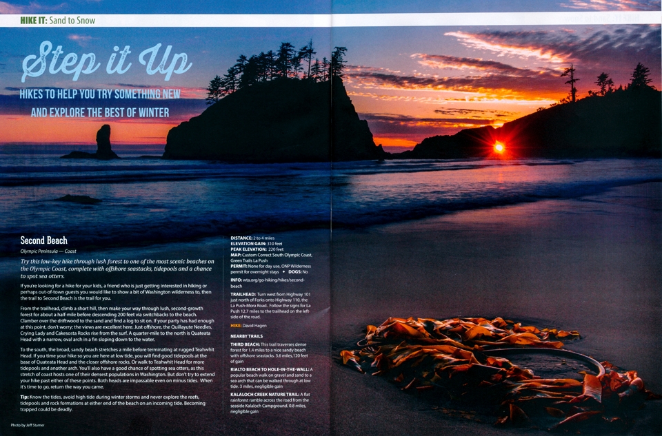
This is a great 2-page magazine spread that was designed by the company Washington Trails magazine. The photographer whose photo was chosen for the article was called Jeff. He works for a company by the name of “Firefall Photography”. The post was made on November 10, 2017, and contains good examples of photography and typography. I discovered this website Proud Papa – Firefall Photography while searching for examples of 2-page magazine spreads on Google.
Typeface Category Identification
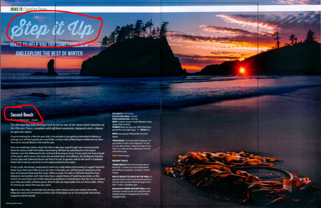
The top circle example is the typeface “script” because it appears to be hand lettered by a paintbrush or a calligraphy pen as the book The Non-Designers Design Book says. It works effectively when it is normally larger in font size and used sparingly. The second typeface is an example of a sans serif typeface where the letter forms are similar in size and lacks serifs at the ends of the strokes.
CONTRASTING elements
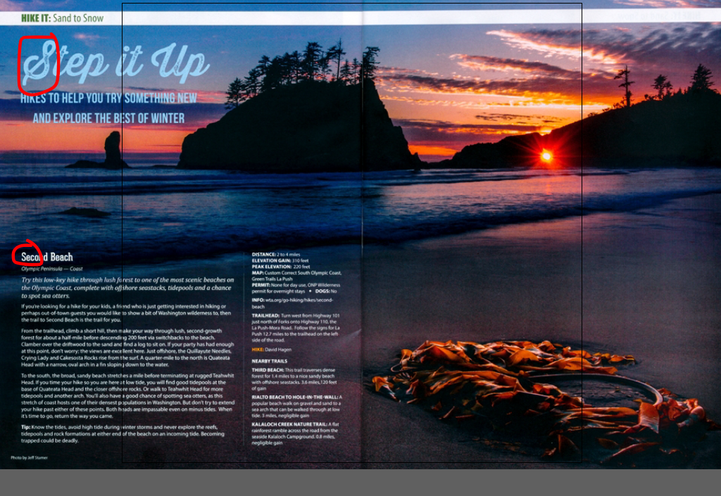
These typefaces are different and show contrast for many reasons. The first is the font size. The script typeface is much larger than the sans serif typeface and also contains paintbrush strokes. It is more eye-catching and fancier which makes it perfect for a title. The sans serif is a bold and straight to the point with its size and makes for a good heading for the following information of the article. The colors are also different. The script is light blue to blend more with the sky background whereas the sans serif is white like the rest of the body text. The weights are also different.
Photography
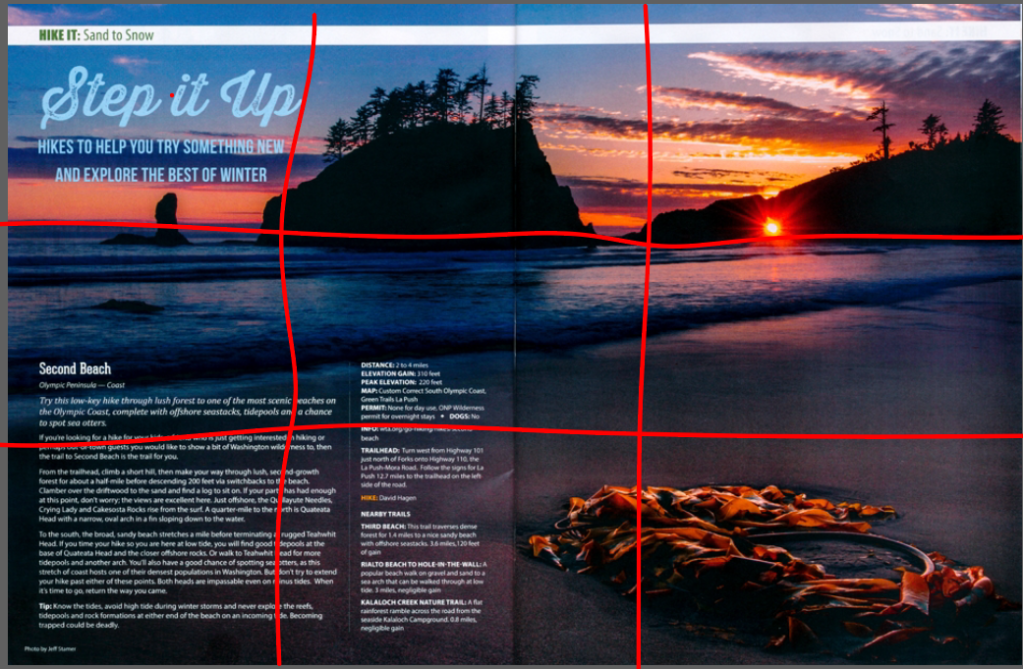
This article demonstrates a very effective use of the “rule of thirds” in many ways. The picture shows the horizon line very clearly on the top line underneath the land masses and where the sky meets the ocean. The points of interest highlight where the land masses come out of the ocean water and also the beach close to the object on the bottom right of the picture. It also shows a good example of the proper use of depth perception by showing the land masses further away from the beach where the close-up shot of the object is.
Interchangeable Photos for Cover

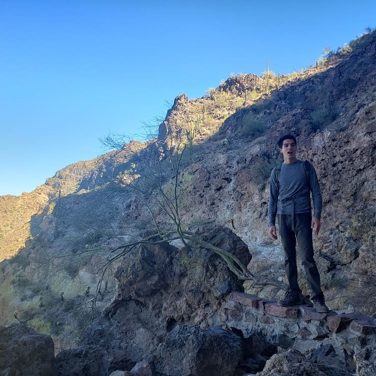

These photos are similar because for one they all contain pictures of me. However, jokes aside, these all show proper examples of depth perception and using a horizon line at the top of the photos. The one that may be missing a proper line is the middle one. Each photo definitely shows depth perception where objects are viewed farther away than where I am standing. I am mainly the close-up shot and usually to the side in each photo. If drawing lines (for the rule of thirds) I would be close to one of the intersecting points.
Overall, these photos and article example all show similar uses of design variables and help explain different typefaces and photography techniques that make the images effective and interesting for the naked eye.
