For the font I used Futura Demi-Bold. The reason for this is because I tried to research what type of typography it was and replicate it for my ad.
This photo uses a lot of good color by only displaying the red and blue of the can of redbull itself to help it stand out. The designer also put the can in the center of the page. They also used great spacing between the Red Bull logo and the Redbull Energy Drink typography. The typography is Futura Demi-bold as I did some research to see what type of font it is. The ‘R’ and ‘E’ may be edited for preference.
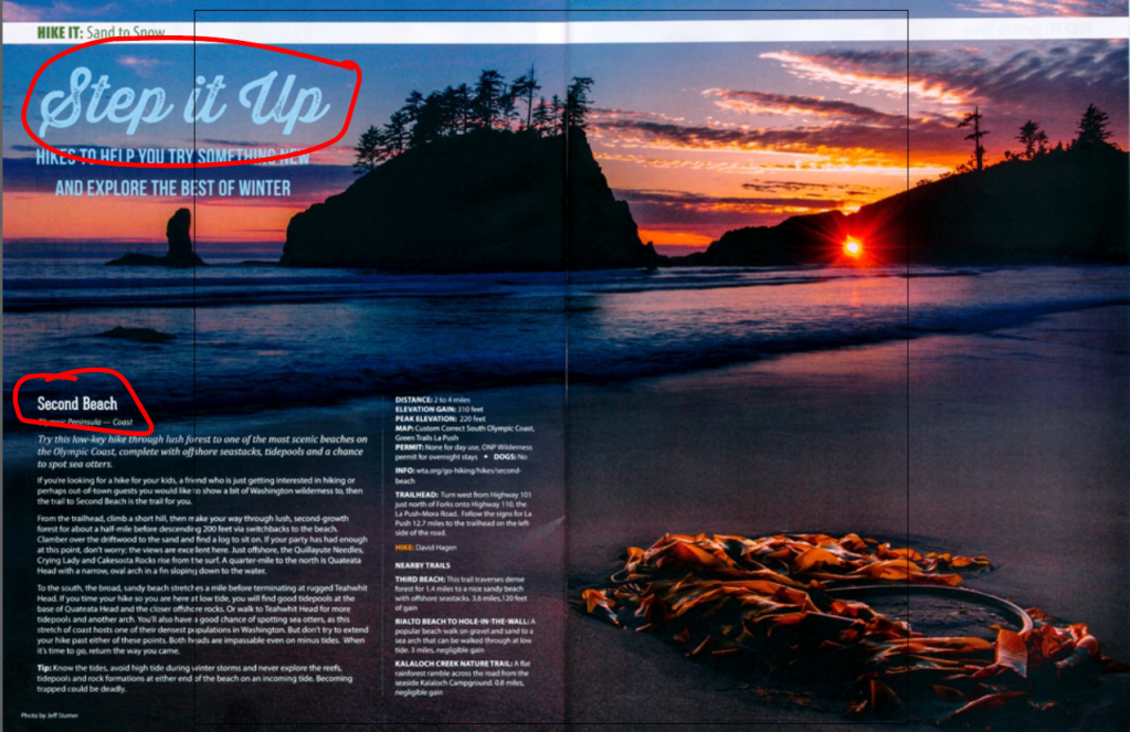
This is a great 2-page magazine spread that was designed by the company Washington Trails magazine. The photographer whose photo was chosen for the article was called Jeff. He works for a company by the name of “Firefall Photography”. The post was made on November 10, 2017, and contains good examples of photography and typography. I discovered this website Proud Papa – Firefall Photography while searching for examples of 2-page magazine spreads on Google.
Typeface Category Identification
The top circle example is the typeface “script” because it appears to be hand lettered by a paintbrush or a calligraphy pen as the book The Non-Designers Design Book says. It works effectively when it is normally larger in font size and used sparingly. The second typeface is an example of a sans serif typeface where the letter forms are similar in size and lacks serifs at the ends of the strokes.
CONTRASTING elements
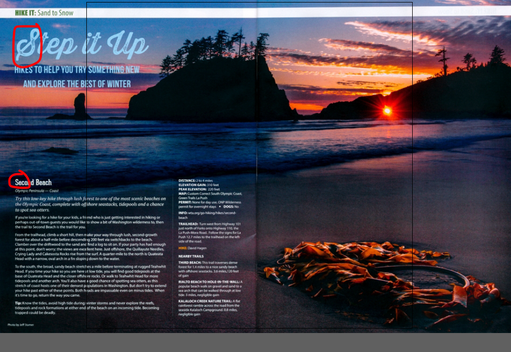
These typefaces are different and show contrast for many reasons. The first is the font size. The script typeface is much larger than the sans serif typeface and also contains paintbrush strokes. It is more eye-catching and fancier which makes it perfect for a title. The sans serif is a bold and straight to the point with its size and makes for a good heading for the following information of the article. The colors are also different. The script is light blue to blend more with the sky background whereas the sans serif is white like the rest of the body text. The weights are also different.
Photography
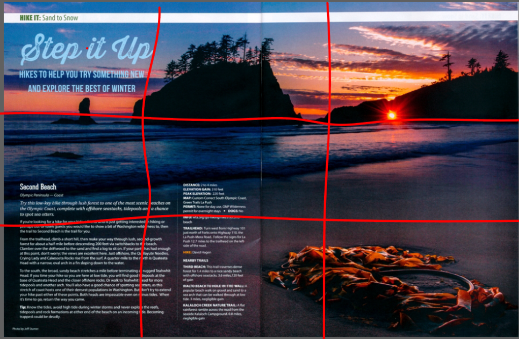
This article demonstrates a very effective use of the “rule of thirds” in many ways. The picture shows the horizon line very clearly on the top line underneath the land masses and where the sky meets the ocean. The points of interest highlight where the land masses come out of the ocean water and also the beach close to the object on the bottom right of the picture. It also shows a good example of the proper use of depth perception by showing the land masses further away from the beach where the close-up shot of the object is.
Interchangeable Photos for Cover
These photos are similar because for one they all contain pictures of me. However, jokes aside, these all show proper examples of depth perception and using a horizon line at the top of the photos. The one that may be missing a proper line is the middle one. Each photo definitely shows depth perception where objects are viewed farther away than where I am standing. I am mainly the close-up shot and usually to the side in each photo. If drawing lines (for the rule of thirds) I would be close to one of the intersecting points.
Overall, these photos and article example all show similar uses of design variables and help explain different typefaces and photography techniques that make the images effective and interesting for the naked eye.
The image analyzed is an advertisement for Dr Pepper from a website called Behance.net. The image itself belongs to the Dr Pepper corporation that is officially called Dr Pepper Snapple Group, Inc., and is currently one of the leading soft beverage companies in the region. Dr Pepper was originally founded in 1885. According to Wikipedia the company was bought out in July of 2018 and is now called Keurig Dr Pepper. This picture was found on google images, but the picture’s link led me to this website Dr. Pepper Ad :: Behance.
Contrast
There are some contrast elements shown in this picture. The main colors used in this picture are related to the brand colors of Dr Pepper which are red and white. The big drink in the center is larger than the others so that our eye is first drawn to the drink before reading the label and text at the bottom left and right of the ad. In this ad the font (electrify you) at the very bottom gives off a stronger look and description to help describe the importance of the Dr Pepper drinks in the center.
Proximity
In this ad the 5 drinks in the center are all in close proximity to each other. This shows their relationship of all being the same drink and portraying the saying that “more is better.” The logo on the bottom left is close to the main message, showing us the relationship between Dr Pepper, and an electrifying taste. The lightning or “electrifying” design is all close to the drinks and is also a good example of proximity.
Repetition
Repetition is exemplified by the repeating Dr Pepper logo on the drinks and on the bottom left of the ad. The logo Dr Pepper is repeated 6 times. The design of the lightning is repeated what seems to be a 100x to demonstrate the significance of the “electrifying” message on the bottom right of the ad. There are also 5 similar Dr Pepper drinks instead of just one that gives off the idea to buy multiple drinks. The same font is used for the three words in the first logo, and a second font is used similarly for the bottom two words.
Alignment
The logo is aligned with the message at the bottom of the ad to show significance. The main image and design of the ad is symmetrical, giving our eyes a clearer image than if the lightning designs and drinks were disproportionate and not symmetrical. The Dr. Pepper logos of the 4 drinks are aligned together and supporting the main drink in the center of the picture.
Color
In many Dr Pepper ads, their main logo colors red and white appear frequently and vividly. This ad does not shy away from that fact and utilizes red and white to a great capacity. Black is also used as a background and supporting color as well as contained in the color of the drink itself. White is used primarily on the words and description of this ad while red and black (main colors of the drink design itself) support the rest of the image. Even the wispy clouds of smoke design are a red color. To emphasize the components of this ad, the color green is used because it complements the primary color of red displayed across this image.
Overall, this ad is striking, and all of the elements contained offer an exciting experience to those who partake of Dr Pepper. The design principles contained in this ad make it simple to understand, but provide a strong, persuasive message urging consumers to buy this product. In this ad, Dr Pepper understands that a simple and easy to understand message goes a long way in creating something great.
Welcome to WordPress! This is a sample post. Edit or delete it to take the first step in your blogging journey. To add more content here, click the small plus icon at the top left corner. There, you will find an existing selection of WordPress blocks and patterns, something to suit your every need for content creation. And don’t forget to check out the List View: click the icon a few spots to the right of the plus icon and you’ll get a tidy, easy-to-view list of the blocks and patterns in your post.
Welcome to WordPress! This is a sample post. Edit or delete it to take the first step in your blogging journey. To add more content here, click the small plus icon at the top left corner. There, you will find an existing selection of WordPress blocks and patterns, something to suit your every need for content creation. And don’t forget to check out the List View: click the icon a few spots to the right of the plus icon and you’ll get a tidy, easy-to-view list of the blocks and patterns in your post.